
How Do You Choose the Perfect Color Temperature for Outdoor Projects?
You just finished a high-end landscape job, but something feels wrong. The expensive cedar fence looks grey, and the stone patio feels like a hospital waiting room. You didn’t mess up the wiring; you picked the wrong color temperature. This is the silent killer of outdoor aesthetics.
For most residential projects, stick to 2700K or 3000K to create a warm, inviting atmosphere that complements natural materials. Only use 4000K for modern concrete or steel structures. Avoid 6000K entirely outdoors as it causes glare, attracts insects, and violates many Dark Sky regulations.
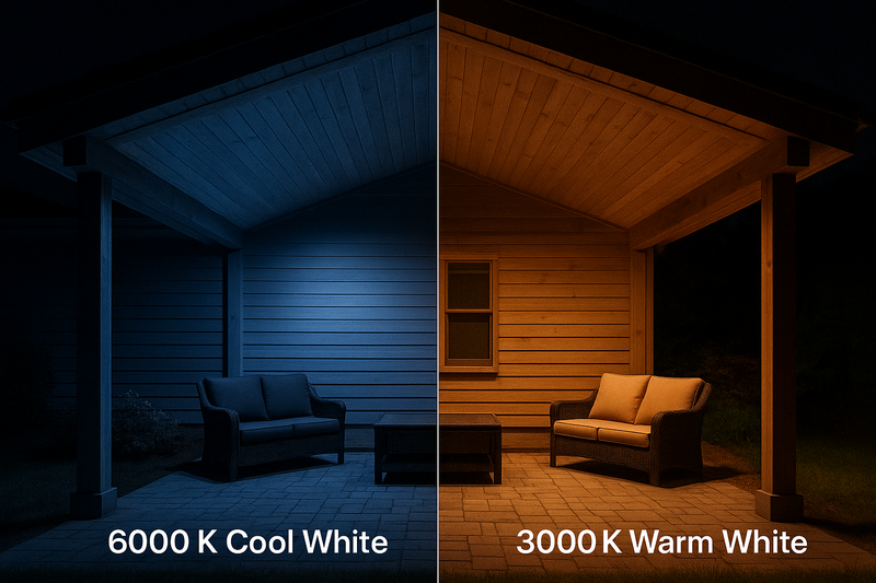
In my factory in Shenzhen, I see thousands of orders come in every month. Ten years ago, everyone bought 6000K "Cool White" because they thought "brighter is better." Today, the professionals have moved on. They know that lighting is about feeling, not just visibility. But there is still a lot of confusion. Clients ask for "Daylight," and you need to know how to explain why that is a bad idea for their backyard. In this guide, I will break down the physics of light and the reality of manufacturing, so you can specify the right strip for every single job.
Does the Material of the House Dictate the Light Color?
A client usually tells you what color light they like, but the house materials actually dictate what color light they need. If you ignore the material science, you end up with "dead" looking textures.
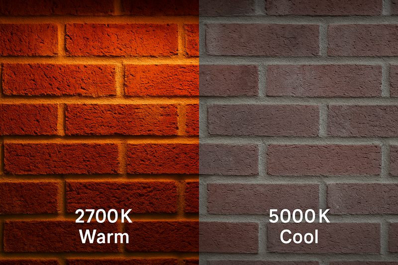
You must match the Kelvin temperature to the dominant colors of the hardscape. Warm materials (wood, copper, brick) require warm light (2700K-3000K) to enhance their natural saturation. Cool materials (slate, granite, concrete) shine best under neutral white light (4000K).
To understand why this happens, you have to understand the physics of different surfaces. Most contractors just stick lights in the ground, but a designer thinks about absorption.
The Physics of Reflection
Every object acts as a filter. A piece of Mahogany wood is essentially a "Red/Orange" filter. It absorbs blue light waves and reflects red light waves.
If you shine a 6000K (Cool White) light source on that Mahogany deck, you are hitting it with high-energy blue spectrum light. Since the wood absorbs blue, it "eats" the light.
- The Result: The wood looks flat, grey, and lifeless. We call this the "Zombie Effect1." The client paid for expensive wood, but you made it look like plastic.
- The Fix: When you use 2700K (Warm White)2, you provide red and yellow wavelengths. The wood reflects these vigorously. The grain pops, and the color looks rich.
Matching Kelvin to Hardscape
Here is the cheat sheet I give to my distributors. Use this to argue against a client who wants "bright white" on a rustic house.
- 2200K (Candlelight): Use this for raw copper fixtures or fire pits. It mimics actual flame. It is very dim, but very moody.
- 2700K (Warm White): This is mandatory for Red Brick, Terracotta, and Dark Wood. It reinforces the warm earth tones. If you put 4000K on red brick, it turns a weird purple-brown color.
- 3000K (Soft White): This is the "safe" standard for the US market. It is perfect for Travertine, Beige Stucco, and Vegetation. It makes grass look lush green.
- 4000K (Natural White): Strictly for Blue Slate, Granite, and Grey Concrete. If you put 2700K on grey concrete, it looks dirty or muddy. 4000K makes it look crisp and modern.
The Danger of Mixing
Never mix color temperatures3 in the same visual zone. I have seen projects where the path lights were 2700K and the step lights were 4000K. It creates visual chaos4. The human brain tries to "white balance" the scene and fails, causing eye strain. Pick a dominant lane and stick to it.
| Hardscape Material | Recommended Kelvin | Visual Effect |
|---|---|---|
| Red Brick / Cedar | 2700K | Enhances reddish tones; makes it feel solid. |
| Limestone / Travertine | 3000K | Keeps the creamy color without turning it yellow. |
| Grey Concrete / Slate | 4000K | Makes the grey pop; enhances clean lines. |
| Green Foliage | 3000K | Makes green look lush and natural. |
Why Is "Cool White" Being Banned by High-End HOAs?
You might have a commercial client who says, "I want 6000K strips because they are the brightest for security." Ten years ago, you would have said yes. Today, you need to warn them that this might get them fined.
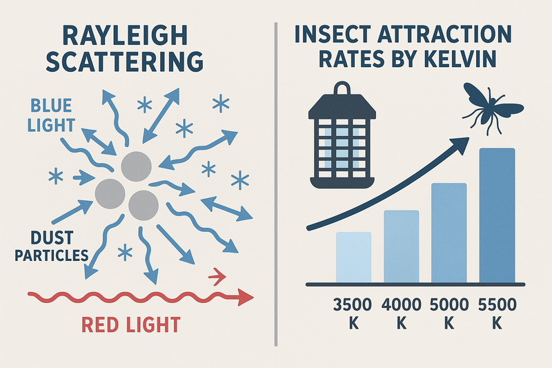
The "Dark Sky" movement is pushing to eliminate outdoor lighting above 3000K to reduce light pollution. Furthermore, physics dictates that Cool White light creates more glare in the atmosphere and attracts 4x more insects than Warm White, creating a maintenance nightmare.
This moves beyond looks. This is about environmental science and biology. If you explain this to your client, you protect them from complaints and headaches down the road.
The Science of Glare (Rayleigh Scattering)
You know how fog lights on a car are usually yellow? There is a reason.
Blue light (Cool White, 5000K+)5 has a very short wavelength. When these short waves hit moisture, dust, or pollen in the air, they hit the particles and scatter in all directions.
- The Problem: If you use 6000K strips outside, you create a "haze" or "glow" around the fixture. You are lighting up the air, not the building. This is light pollution. It blinds the neighbors and washes out the stars.
- The Solution: Warm light (3000K and under) has a longer wavelength. It cuts through the air. You see the object you are lighting, not the air between you and the object. This satisfies "Dark Sky" regulations.
The Insect Factor
This is the best selling point for residential owners. Insects are phototactic, but they are most sensitive to the UV and Blue spectrum.
- The Reality: If you install a 6000K bright white strip under a patio railing, you are building a bug magnet. The client will not be able to sit there in summer without swatting moths.
- The Fix: A 2700K strip6 has very little blue spectral energy. It is almost invisible to many flying insects. Simply changing the color temperature can reduce insect presence on a patio by 50%.
Biological Comfort
Blue light suppresses melatonin (the sleep hormone). That is great for an office at 9 AM. It is terrible for a backyard at 9 PM. Your client goes outside to relax with a wine. If you blast them with 5000K light, their brain thinks it is noon. They will feel alert/anxious. 2700K mimics firelight, triggering the brain to relax.
| Issue | 6000K (Cool White) | 2700K (Warm White) |
|---|---|---|
| Glare | High (Scatters in air) | Low (Cuts through air) |
| Bugs | Magnet for moths/mosquitoes | 50% less attraction |
| Mood | Alert, Clinical, Tense | Relaxed, Cozy, Safe |
| Regulations | Often Banned (Dark Sky) | Generally Approved |
2700K vs 3000K: Is There Really a Difference?
To a layman, these two look almost identical on the box. But once you install 100 feet of it, the difference is huge. This is the most common question I get from my B2B clients in the US.
2700K is the classic "Incandescent" look, very cozy and slightly yellow, ideal for residential relaxation zones. 3000K is the "Halogen" look, slightly whiter and crisper, ideal for task areas or modern homes. 2700K feels like "Home," while 3000K feels like "Design."
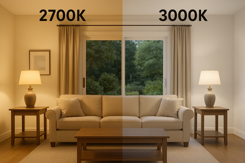
Choosing between these two is about understanding the vibe of the architecture. It is subtle, but details matter.
The "Yellow" Fear
Many homeowners are terrified of "yellow" light because they remember old, cheap lightbulbs.
- 2700K7: Yes, it has a golden tint. It mimics the old filament bulbs. It creates a very intimate space. It is forgiving to skin tones (makes people look tan).
- 3000K8: This removes most of the yellow without adding blue. It is a clean white. It is the standard for art galleries and high-end hotels.
Regional Preferences
Interestingly, as a factory, I see data on where these ship.
- Northern US / Canada: People prefer 2700K. When it is cold outside, you want the light to feel warm and cozy.
- Southern US / Florida / Texas: People prefer 3000K or 4000K. When it is hot outside, you want the light to feel crisp and cooling, not sweltering.
Application Specifics
You can mix these if you are careful, but usually, I recommend:
- Fire Pit / Seating Area: Go 2700K. You want low energy, relaxing vibes.
- Outdoor Kitchen / BBQ: Go 3000K. You need to see if the chicken is cooked. 2700K can mask the color of food.
- Security Perimeter: Go 3000K. It provides slightly better contrast for security cameras than 2700K.
| Feature | 2700K | 3000K |
|---|---|---|
| Color Tone | Warm, Golden, Cozy | Soft White, Crisp |
| Best For | Patios, Decks, Rustic Homes | BBQ, Modern Homes, Security |
| Skin Tones | Flattering (Healthier look) | Neutral (Honest look) |
| Camera Visibility | Good | Better |
Why Do My "Same Color" Strips Look Different?
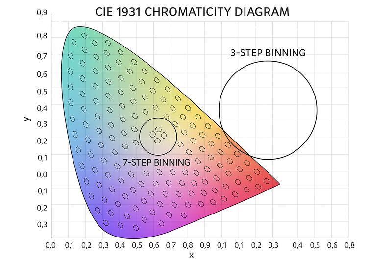
You bought a roll of 3000K last year. You bought another roll of 3000K today from a different brand. You put them next to each other, and one is pinkish while the other is greenish. Why?
This is called "Binning." LED chips are sorted by color variance. Cheap suppliers sell mixed bins (SDCM 5-7), creating the "Rainbow Effect." You must specify "3-Step MacAdam Ellipse" to ensure tight consistency across different batches and repairs.
This is the factory secret that saves you money and reputation.
How We Bake LEDs
Making an LED is like baking cookies. We bake phosphorus onto a blue chip. Even in a perfect factory, there is variance.
Out of 10,000 chips targeting "3000K":
- Some are exactly 3000K.
- Some are 2850K (Red shift).
- Some are 3150K (Green shift).
We use a machine to sort these into "Bins."
The Cost of Consistency (SDCM)
We measure this variance in MacAdam Ellipses (SDCM).
- 3-Step (Premium): I only pack the chips that are basically perfect. The human eye cannot see the difference between them. This costs more because I have to throw away the outliers.
- 5-Step or 7-Step (Cheap): This is what you get on Amazon or eBay. They take the outliers. One roll might look pink, the next might look green.
- The Nightmare: You install a project. A mower cuts the line a year later. You buy a new roll to fix it. If you didn’t buy 3-Step binning, the new section will create a visible color line. The client will hate it.
How to Order Correctly
When you source from China or a local distributor, ask: "What is the binning step?"
If they don’t know, they are just a middleman.
If they say "3-Step," you are safe.
Also, a good factory keeps your Bin Code on file. If my client Tom buys 3000K today, I record his Bin Code. When he orders in 2026, I send him chips from the exact same coordinate on the color chart.
| Standard | Visual Result | Typical Usage |
|---|---|---|
| 3-Step MacAdam | No visible difference | High-End Residential / Commercial |
| 5-Step MacAdam | Slight variations visible | General Lighting / Warehouses |
| Unbinned | Visible Pink/Green tint | DIY / Holiday Lights |
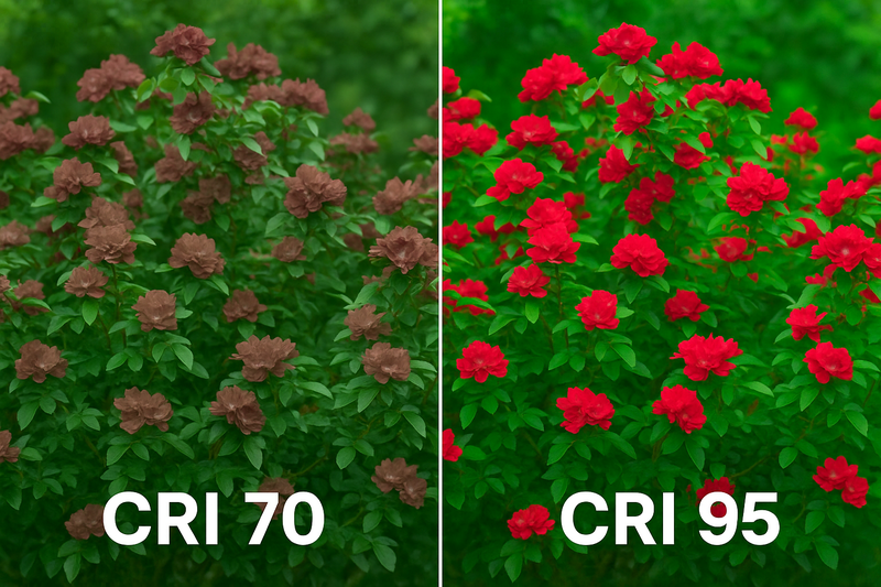
Does CRI Matter for Outdoor Lighting?
You might think CRI (Color Rendering Index) only matters for art galleries. But if you are lighting an expensive Japanese Maple tree or a bluestone wall, low CRI makes it look like cheap plastic.
CRI measures how accurately a light reveals pure colors. For outdoors, standard CRI 80 is acceptable for pathways, but you should use CRI 90+ for vegetation and red brick. Low CRI lights lack the "R9" red spectrum, making wood and leaves look dull and muddy.
CRI is the difference between "Light Quality" and "Light Quantity."
The "Muddy" Garden
Have you ever seen a landscape at night where the grass looked sort of grey-ish green? That is low CRI.
Most cheap LED strips are CRI 70 or 80. They are missing key parts of the light spectrum, specifically the Red spectrum.
- without strong Reds, wood looks flat.
- without strong Reds, green leaves look waxy.
The R9 Value
The general "CRI" score is an average of 8 colors. But there is a hidden score called R9. This measures Saturated Red.
- Many "CRI 80" strips have a negative R9 value. They literally cannot show red.
- For outdoor lighting, Red is crucial. It is in the dirt, the bark, the brick, and the skin tones of people.
- My Advice: Spend the extra 10% to get CRI 90+. It usually guarantees a positive R9 value. Your client won’t know why it looks better, they will just say it feels "richer."
Efficiency Trade-off
There is one catch. High CRI chips are slightly less efficient. A CRI 90 strip might be 10% dimmer than a CRI 80 strip at the same wattage.
But outdoors, we usually have plenty of power. I would trade 10% brightness for 50% better color quality any day.
| CRI Level | R9 (Red) | Best Application |
|---|---|---|
| CRI 70 | Very Low/Negative | Streetlights, Parking Lots |
| CRI 80 | Low/Average | General Grass / Pathways |
| CRI 90+ | High | Expensive Flowers, Wood Decks, Faces |
Conclusion
Don’t let bad color temperature ruin good architecture. Stick to 2700K for cozy vibes or 3000K for clean looks, avoid the "Blue Light Special" of 6000K, and always pay extra for 3-Step Binning to ensure your lights match today, tomorrow, and next year.
-
Understanding the Zombie Effect can help you avoid costly mistakes in lighting design, ensuring your materials look their best. ↩
-
Exploring the significance of 2700K can enhance your knowledge of color temperatures and their impact on various materials. ↩
-
Learning about color temperatures can improve your lighting choices, making your spaces more visually appealing. ↩
-
Understanding visual chaos can help you create harmonious lighting schemes, avoiding eye strain and enhancing aesthetics. ↩
-
Understanding blue light’s impact on health can help you make informed lighting choices for comfort and well-being. ↩
-
Exploring the benefits of 2700K lighting can significantly enhance your outdoor experience by reducing unwanted insect presence. ↩
-
Explore the advantages of 2700K lighting for creating warm, inviting spaces, perfect for cozy atmospheres. ↩
-
Discover why 3000K lighting is ideal for art galleries and modern homes, enhancing visibility and aesthetics. ↩
Interested in Our LED Solutions?
Get professional consultation and customized LED lighting solutions for your projects. Contact our expert team today.
Related Articles

How Do You Build Profitable Custom Vehicle and RV Interior LED Rope Lights?
You lose RV installation contracts because your interior lights fail on rough roads. Standard strips show bright dots on glossy…

How to Perfect Bookshelf and Display Cabinet LED Rope Lighting?
You lose retail clients when bookshelves look incredibly dark. Ugly shadows hide expensive products inside display cabinets daily. You need…

How to Master Mirror and Vanity LED Rope Light Installation?
Your clients complain about ugly shadows in their bathroom mirrors. Bad lighting ruins expensive vanity designs. You lose future contracts…
